Skip to content
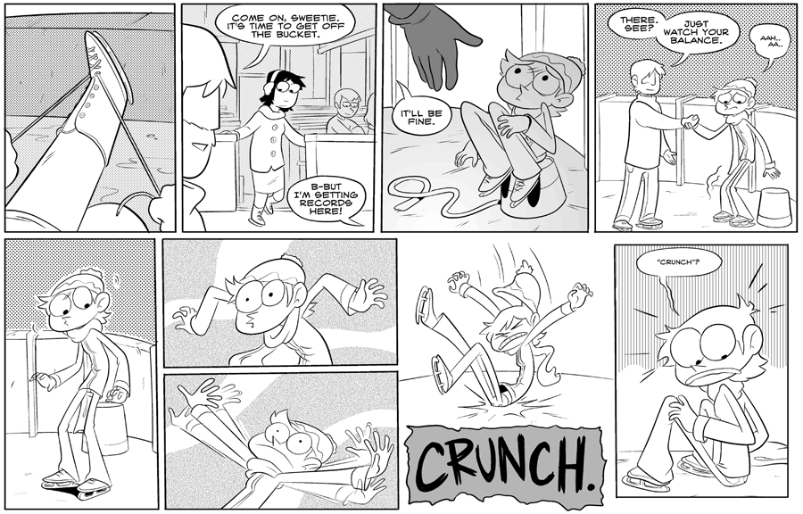
Something I didn't give a lot of care to in earlier OP strips was the placement of the words. I made sure they fit into the panel, but didn't consider the journey of the eye. The last 2 panels here are particularly jarring for the reader, asking them to move from the bottom of panel 8 to the tippy top of panel 9. If I redid this I'd probably have Hanna on the bottom of panel 8, to follow the action of the previous panel and leave space on top for the text.
5 thoughts on “#088 – crunch”
Takver
Love her expression in panel 7.
Alai
I like it the way it was. The crunch is under her, where it belongs.
Ea Rayos
I didn't really mind here. It kind of had an effect of legit wonder after hearing something at the bottom crunch. Badum tss
Manders
I personally like the sound effect box at the bottom of panel 8, like her butt is CRUNCHing right into the sound, but I see what you mean about the readability.
Marvin Choi
I mean, imo, the text placement being jarring works here, because the actual action is jarring. Disorientation due to layout can be a useful tool.