Skip to content
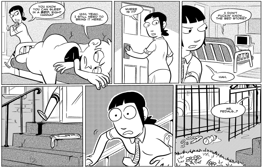
It's interesting for me to look back on these early pages and see what my priorities were, layout-wise. I very much saw the need to let Hanna's hand dangle outside the borders of panel 1, sort of an arbitrary graphic design choice. The need to build drama in the lower tier wasn't really on my mind.
Overall the horizontal page was a bit limiting, but I was still figuring so much out here in particular. I played with textures more than the panels themselves. So much that feels like muscle memory now was invisible then.
Just an aside, hopefully people won't think I'm being hard on myself when I critique these pages. I'm very proud to have done all this work. It's an example of why as a comics teacher I try to emphasize productivity over mere theoretical studies. You just have to see and do it for yourself to be able to look back on it.
7 thoughts on “#009-the-bed-store”
Battlehawk
I'm loving this trip through all the old comics, it's really interesting seeing how you view the beginning with everything you've learned since.
ThatOwlGuy
That panel with her tie up like that…
Was that a Dilbert reference?
Tom
Hannah's line in panel is 3 is probably the first line in the comic that made me really crack up reading it. Her attitude and general lifestyle here felt like a perfect parallel at the time to my post-college life.
Ezzy
I love these insights into the old pages. It's certainly making me more aware of what I do when I storyboard my own comics.
Marvin Choi
aw man, I had totally forgotten she used to wear a tie
ArthurBarnhouse
Eve’s outfit is really nice in this. I feel like she didn’t dress that formally in later comics
thoss
I'm really enjoying the technical critique.