Skip to content
The original page of this comic is for sale! SOLD!
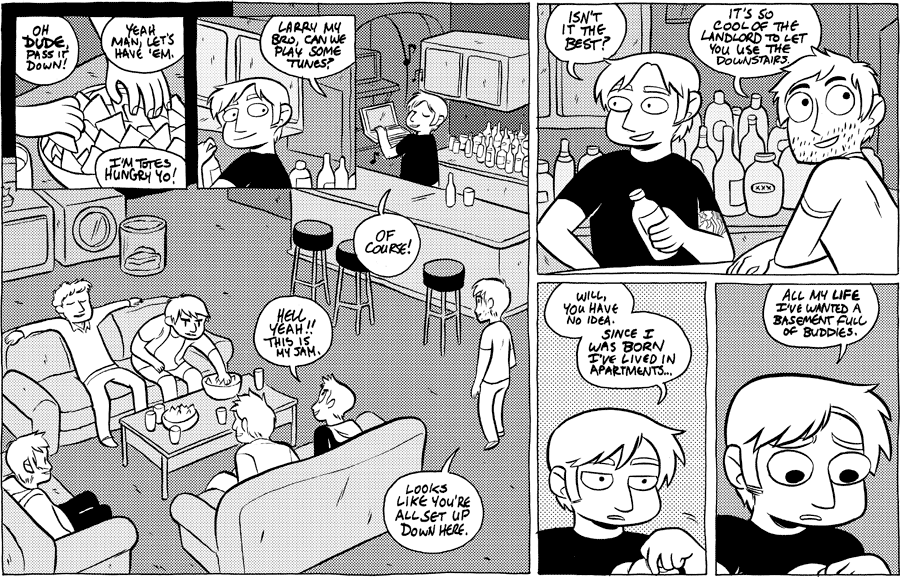
Forgive the wait for comics, folks - I've been hard at work on the next book collection! But things are wrapping up, so here's a comic. This will be a short story, just a few pages long.
I was interviewed recently by Zack Smith at Newsarama. I got to talk quite about the writing process of Octopus Pie, which is a subject I don't have many chances to discuss. Check it out here!
I've gone back to brush inking at last, after doing things digitally since October. I really enjoy drawing on paper, and it's good to be back to it. You'll also notice the lettering in this one is done by hand. This is something I've been avoiding for a while out of fear that it wouldn't look good. But like most things, there's no improving without doing. So if you find the text jarring, bear with me while I work on it.
More news on the book collection coming soon!
50 thoughts on “#454 – basement full of buddies”
MST
The lettering looks great, Meredith!
@TehCoolRich
I Really enjoy these subtle Art changes. makes it a bit more fresh and interesting, without deterring too much from the core of Octopus Pie. Keep up the great work!
Jon-Marc
So glad you're back to using a brush! It has a much better feel to it, digital just looks so "calculated" to me. And keep at the hand-lettering, it looks great!
Brian
I like the hand-lettering much better. I feel like it's always preferable for an artist to letter their own work, since it'll mesh so well with their art style. You might want to make the letters a bit thinner so that they're a little more readable, but it honestly works fine enough as is for me. Can't wait to see more pages!
myopiczeal
I like the brushwork and the lettering; they both seem to better complement your particular art style.
FYI, Sam Logan at Sam and Fuzzy uses a font made of his own handwriting, to provide the artistic continuity you've got going, while making sure the lettering is consistent and will fit within the panels. Just a thought.
Sebastian
I really do like Sam Logan's font. Nice and concise, distinctive but not too distinct.
Laika
Larry appears to prefer blondes.
Ana
book collection! yaaay! looking forward to throwing some money at you, Meredith. 🙂
hand lettering looks pretty good, btw. very different, though, I'm still getting used to it.
Random McPerson
Ana? um, Ana who? Where are you from? just making sure you're not someone I know… unless you are….. are you?
Pie
yay will!
Mdenholm
Yay hand lettering! Yay Will! Yay Octopus Pie!
Def
On top of the inviting nature behind the art style… WILL's BACK!
I feel like Will in my life :(d
Nick
Devil's advocate: I kind of like the clean, professional style that fonted word bubbles lend to the comic. I feel like it fits with the art style. I'm also having some legibility issues above, although nothing extreme.
Still I'm happy to see how things morph from here. Personally, my handwriting is so bad that I can hardly complete basic notes and have them be legible. Feels like I was born with a keyboard at hand…
shoeboxjeddy
I have to agree with Nick here. I absolutely think you should do whatever you want, as the comic is amazing, I just think the lettering in its current state is rough and inferior to the style used previously.
Girl
I agree too! I did like the clean look of the font before. This new hand written font gives the impression that they're…..yelling or something.
However maybe it's just something I need to get used to! And I definitely see the benefit in trying new things as an artist. So keep on keepin on!
Trae
I very strongly agree with Nick. I personally don't care about how you letter it, as I like handwritten dialogue, but I personally prefer the artwork itself in its digital aesthetic. As someone who makes a lot of digital art myself, I have to admit that I really love clean artwork. Your style is also a lot cuter and, as Nick said, more professional-looking (though not in a calculated or clinical manner) when done digitally. This, while not bad, looks more toony.
Anyways, like others said, it's your comic and you should definitely do whatever you prefer. This is just one fan's opinion.
Mayday
Mad Snax Yo: The Bro-ening
Welldone
Wow, at first the text was a little like "waaah what's going on!" However then I went back and looked at the previous comic and it feels like an entire extra dimension of life was sucked out of it. Keep up the hand written text! It's really a phenomenal improvement in storytelling.
Carl-E
I love basement bars. The smell of laundry, food, beer and "rising damp"…
@xuebles
Nice! Cool Kids on the scroll over! Love that song!
Arkadi
Hand-written letters! Cool! ^^
Alicia
awesome! i like to this hand-drawn look. keep it up!
Booga
Will's back! He makes me so mad sometimes, but God help me if he isn't one of the finer looking comic characters of all time. Scruffy men…
Bruce the Great
Comic looks awesome, lettering is a bit heavy, but readable. It goes well with the art too, I vote keep it!
Sela
Either way, it looks good! I dig the feel of the hand lettering though, to be honest.
But Octopus Pie animated series? Hnngh, I'd die of happiness. That'd be cool if it came to fruition!
@ModernViolinist
Yay, brush inking! There's something that's just so more fun and organic about how the lines feel.
Nathan
I love the thicker brush you used for the line work. It gives the comic a warmer look.
@MarikTBone
It's cool Larry, I too feel let down that my life wasn't morel like That 70's Show…
mmmmarley
a basement full of buddies is the best, forever.
also, i like the hand lettering! i also like when you do it digitally! i like that i get to see your digital and traditional work!
Hadas
For a second there I thought Bryan Lee O'Malley had done a guest strip for you.
@CriLauren
I love OP no matter what medium it's in. The hand lettering is a nice new touch though. Also: WILL IS BACK! I couldn't be happier, I missed him!
Thomas
I like the dialogue on this one! It comes off as very natural. At the same time, it's a bit over the top, even a little surreal. These dudey dudes talking about food, like a bunch of girls, while trying hard to outdude each other.
@CLRgrrl
May I ask why the switch to inking by hand (again)? Signed, a Process Nerd.
Also: I love Will. Have I said this enough? Probably.
granulac
I just switch back and forth a lot, I guess! I switched to digital because it simplified my workspace, and then switched back when I had the right setup again. I like both!
BradyDale
I think we have all always wanted a basement full of buddies. Not many people seem to actually get it, tho. It's a dream fostered by TV. You have to be lucky enough to both have a lot of friends, and to also live really near them and to also have friends who have enough time that they can all manage to come over at the same time.
He shouldn't feel bad if he's never had it before. It doesn't happen much to many but the most lucky people.
I'm definitely not one of them.
Heidi
1) I genuinely hope you are not reading any of these comments.
2) If you are, ignore ANYTHING ANYONE says about "Oh, digital font is much more professional!" or "Oh, digital lines are so much cleaner!"
They are also static and boring as well.
I don't care for digital art in the least, and I refuse to ready many comics these days because they are done almost entirely in Photoshop.
There is an organic beauty that traditional artwork has, both in comics and in paintings, charcoal work, pen and ink, etc., that digital lacks in the worst possible way.
More than once I lament the day digital art ever came onto the scene.
Incidentally, I know what people like to argue, and that digital art can be hard to do. Perhaps, and that is why you have that lovely "undo" button. Traditional art forces you to work with what you have done, and often times some of the greatest pieces comes from "I didn't mean to do that."
btw, I taught college level art (Art Institute of Cincinnati, if you would like to know). I had one too many students come through my classes that could do all this "fabulous" artwork in Photoshop, because they knew the right sequence of buttons. But, when a pencil and paper was put in front of them, they froze like a deer in headlights.
And more often that not, their drawings look what happens when a deer loses a battle with headlights.
So brava for you Meredith. I 100% applaud your decision and have 100% faith you will excel!
granulac
1) I do read the comments.
2) I'm pretty secure in my ability to grow as an artist, and have a trusted group of peers I go to for feedback. So don't worry about comments swaying me too much. 🙂
I don't want to see a big debate here on digital vs. traditional methods. I use them both regularly, and have for well over 10 years. Even my ink-on-paper comics involve the use of a Cintiq.
I think it's important for artists to be open-minded about all media available to them, both from a self-improvement and professional standpoint. There is no right or wrong way to do things, though I agree people get wrapped up in digital thinking it will somehow make their art "better".
Stepping out of one's comfort zone is far more important for artistic growth than picking the right tools – though the two can go hand in hand. I only learned to use a brush a few years ago, and it's made a world of difference.
Eat The Babies!
I agree. I strongly, strongly favor non-digital lettering. Lettering by hand is much more appealing (to me). Digital lettering is a big turnoff, but that's just me! To each their own! And your lettering is easily legible. I never have any trouble.
AlmostLiterally
I love the lettering! And it's great to see Larry again.
Tracy
Okay, I'll be honest: I don't like the hand-lettering. It's distracting and hard to read. I seem to be somewhat in the minority, though, so I'll just slink back off to my little lurker corner and keep quiet. 😉
Naomi
SO HAPPY to see Will!!!!
Mer
I like the hand-lettering but it would be more legible if the lines were thinner. Your handwriting is good but the thick lines make me squint a little when I try to read the word-bubbles. The bolding for emphasis kind of gets lost in the thicker lines here, too.
Mental Mouse
I’d say digital vs. hand lettering is mostly a matter of “you pays your money and you takes your choice”. Each has its own advantages and hazards, and which you prefer depends on not just your skills and equipment, but your “eye” — the feel you want for your work.
Digital: Used well, drops the dialog into the visual background. Used poorly, looks like you stuck labels on your art. More predictable space-wise, less flexible style-wise. Analog: dialog tends to merge with the art, for better or worse. Easier to play stylistic games with (like Garrity’s “madness fonts”). But hand-lettering also allows for some other distracting mistakes, such as unreadable bits, or just dragging the eye away from the focal image.
Whichever Meredith goes with, I’m sure this will continue being a great comic!
Ryan
I think the hand lettering in this one was very evocative of a rowdy basement of bros and dudes.
Dell
I'll have to reiterate what has been previously said but in my opinion not enough: I love how this comic constantly switches mediums. I hope that it will always have a balance of the two(maybe more?) and never settle. Of course I have a favorite, but each one has its advantages, and I respect you as an artist for understanding that your art is alive, it's about growth.
suddenlyflash
Good lord, all his buddies are…. so stupid.
sandtrap
…totes… TOTES!!!
Shras
When this page first popped up, I thought it said 'Basement full of bodies' lol
Nghia
popping in from 2019 just to say this comic is so amazing.
i mean ive been following one of my fav webcomics since 2015- to now, and goddamn, this is my new favorite.
Yes. It's that good.
Jill
I love the hand-lettering here. Calls to mind a certain type of comic I can’t quite put a name to… maybe I’m just thinking of indie comics in general, or, I don’t know, hourlies. Either way it’s nice. Always good to have a bit of variety. Also serves as a reminder that I’ll have to actually spend time improving my atrocious handwriting for whenever I get around to starting one of these.